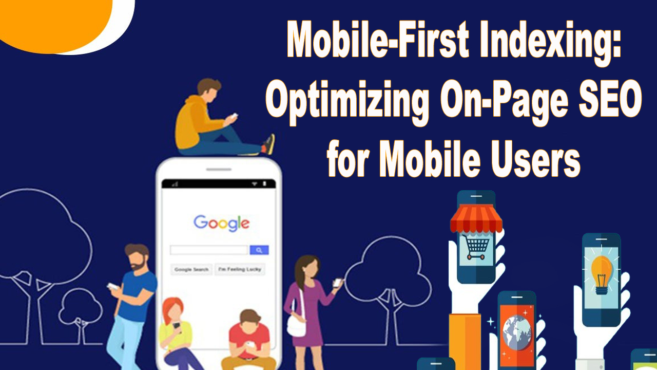
Our smartphones have become like trusted companions always at our fingertips. Whether we’re checking the latest news shopping online or searching for information we often turn to our mobile devices. Recognizing this shift in user behavior search engines like Google have introduced a new approach called Mobile First Indexing. This means that when it comes to ranking and indexing websites the mobile version takes the lead over the desktop version. In this article, we’ll explore the importance of Mobile First Indexing and share some easy-to-follow tips on how to make your website shine in the eyes of mobile users while boosting your on-page SEO. Get ready to unlock the secrets to a mobile-friendly online presence!
Table of Contents
Understanding Mobile First Indexing
What is Mobile First Indexing?
Mobile First Indexing is like a special way search engines look at and organize websites. Imagine you have a website and it has both a version for computers and one for mobile phones. With Mobile First Indexing the search engine mainly pays attention to the mobile version when deciding how to show results to people searching on their phones. So if your mobile site is easy to use and has good content it’s more likely to appear at the top when someone searches on their mobile.
This change happened because more and more people are using their phones to search and browse the internet. Search engines want to make sure they provide the best and most helpful results for mobile users. That’s why understanding Mobile First Indexing is important for anyone who has a website it s like giving your site a mobile-friendly makeover to make sure it’s seen and liked by search engines and the people searching on their phones.
Why Mobile First Indexing Matters

Mobile First Indexing is a big deal because lots of people use their mobile phones to explore the internet nowadays. When you search for something on your phone the search engine wants to show you the best results that work well on your mobile screen. That’s where Mobile First Indexing comes in. It means search engines look more closely at the mobile version of websites when deciding what to show in search results. So if your website is all set up to look good and work smoothly on mobiles it’s more likely to be seen by people searching on their phones.
Imagine if your favorite store had two entrances one for big doors and one for smaller ones. If more people started using the smaller entrance the store might decide to focus more on that entrance to make everyone’s shopping experience better. That’s a bit like what’s happening with Mobile First Indexing. Search engines are paying more attention to the smaller entrance of the mobile version of websites to make sure people get the best and easiest experience when searching on their phones. So if you want your website to be popular and easily found making it mobile-friendly is the way to go!
Optimizing On Page SEO for Mobile Users
Responsive Design A Foundation for Success
Making your website look good and work well on both big computer screens and small phone screens is super important. We call this clever design the trick responsive design and it’s like the foundation of a strong and successful website. Just think of it like this if your house had different doors for tall and short people you’d want to make sure both doors open smoothly for everyone. Similarly responsive design ensures your website is like a friendly door that opens easily no matter if someone is using a big computer or a small phone.
So why is this a big deal? Well, most people use their phones to check out websites these days. If your website is not responsive it’s like having a door that’s too small for a lot of visitors. They might struggle to get in and that’s not a good experience. But with responsive design, your website becomes like a welcoming place for everyone whether they’re using a computer or a phone. It’s the secret sauce for a website’s success in the digital world!
Mobile Friendly Content is Key
Creating content that’s friendly to mobile users is super important in today’s digital world. When people are on their phones they prefer content that’s easy to read quick to understand and fits nicely on their screens. This is where mobile-friendly content comes into play it s like serving up information in a way that’s comfortable and enjoyable for folks scrolling through their phones.
Think of mobile-friendly content as bite-sized bits of information. Instead of long paragraphs break things up into smaller sections. Use headings that tell people what each part is about and throw in some bullet points to make things even clearer. Mobile users appreciate content that gets straight to the point and does not make them scroll forever. So by making your content mobile-friendly, you’re making sure your website speaks the language of the small screen keeping visitors happy and engaged. It’s like giving them a smooth and easy ride through the information highway!
Optimize Images and Multimedia
Making images and videos on your website work smoothly for mobile users is a smart move. Imagine you have a cool video or a bunch of pictures but if they take forever to load on a mobile phone it’s like waiting in a long line not fun at all. So to keep things snappy and enjoyable you need to optimize your images and multimedia.
Optimizing is like giving your pictures and videos a little makeover so they look great without taking up too much space. Big files can slow down how fast your page loads on a phone and that’s a bit like a slow-motion video, not the best experience. Compression is the hero here it shrinks those files without losing the good stuff. So when someone clicks on your website using their phone everything loads quickly and they get to enjoy your awesome content without any waiting game. It’s like making sure your pictures and videos are the VIPs that get to the party on time and in style!
Speed Matters Improve Loading Times
Let’s suppose you’re at a race and there are different websites lined up to compete. The winner is not the one with the fanciest design or the coolest content it’s the one that loads the fastest. That’s why the speed of your website is super important, especially for mobile users who do not like waiting around. So if you want your website to be the Usain Bolt of the internet you need to improve its loading times.
To speed things up you can do a few tech-savvy tricks. Minimize the number of requests your website makes like asking for too many things at once. Imagine if you had to carry a huge pile of books it would slow you down. Well, the same goes for your website. Also, tell your browser to remember things (we call it caching) so it does not have to fetch everything each time someone visits. It’s like having a handy assistant who already knows what you want. By doing these speedy adjustments you make sure your website sprints to the finish line leaving a positive impression on mobile users who appreciate a fast and efficient experience.
User Friendly Navigation
Your website is like a city and visitors are explorers trying to find their way around. To make their journey enjoyable you need user-friendly navigation it’s like putting up clear signs and smooth pathways. When people visit your site on their phones they want to get to the information they need without feeling lost. So creating a user-friendly navigation system is key to keeping them happy explorers.
Simplify your menus like you’re making a menu for a tasty meal not too many choices to overwhelm but enough to satisfy different tastes. Use big friendly buttons that are easy to tap just like simple road signs that everyone understands. Mobile users do not want to go on a treasure hunt for information so make sure your website is like a well-marked city with easy-to-follow directions. When visitors can navigate effortlessly it’s like you’ve given them a handy map ensuring they enjoy their exploration and find what they’re looking for without any detours.
Implement Mobile SEO Best Practices
To make your website friendly for mobile users think of it as making a fast and easy-to-use path right to your door. Mobile users like things quickly so make sure your website loads super fast by making pictures smaller and cutting down on anything that is not necessary. It’s like when you’re trying to catch a bus you would not want anything slowing you down. Also, switch to using modern web tech like HTML5 instead of old stuff like Flash which some phones can not handle. This way everyone can enjoy what you’ve put on your site no matter what kind of phone they have.
Also, do not forget that a lot of people use their phones to look up places and shops nearby. So if you have a business with a physical location make sure your address and phone number are easy to find and correct. You can even use services like Google My Business to help people find you more easily. It’s like putting up a big bright sign that helps people find your shop on a busy street. By doing these things you’re making sure that anyone who visits your website from their phone has a smooth and pleasant experience just like they would if they visited your
Pros & Cons
Pros
- With Mobile First Indexing your website is more likely to show up in search results when people use their mobile phones. This means more eyes on your content.
- Optimizing for mobile users ensures that your website looks good and works well on smaller screens providing a positive experience for visitors on mobile devices.
- Google gives preference to mobile-friendly websites in its ranking algorithm. So if your site is optimized for mobile it stands a better chance of appearing higher in search results.
- As more people shift to using mobile devices for internet browsing adapting to Mobile First Indexing reflects an understanding of and adaptation to changing user habits.
- Since many users access the internet primarily through mobile devices optimizing for mobile ensures that your content reaches a broader audience.
Cons
- If your desktop and mobile content significantly differ there’s a risk that valuable information on the desktop version may not get the attention it deserves.
- Websites that are not designed to be mobile-friendly may face difficulties in adapting to Mobile First Indexing potentially leading to lower rankings and visibility.
- Optimizing for mobile requires time effort and resources. Smaller businesses or those with limited resources may find it challenging to keep up with the demands of Mobile First Indexing.
- Some features that work well on desktops may encounter issues on mobile devices. For example, intricate designs or complex functionalities may not translate seamlessly to smaller screens.
- Mobile technology evolves rapidly. Keeping up with the ever-changing landscape of mobile devices and ensuring ongoing optimization can be demanding for website owners and developers.
Final Thoughts
Mobile phones making friends with Mobile First Indexing is like having a secret handshake that opens doors to more visitors. By making your website mobile friendly you’re saying Hey come on in we’ve got something great for you! It’s not just about impressing search engines it’s about making sure every person with a mobile phone has a fantastic time exploring your site. So keep it speedy use friendly navigation and serve up content that’s like a good story easy to understand and enjoyable. With Mobile First Indexing you’re not just keeping up you’re leading the way in the mobile-friendly online world!

Dilshad Mushtaq is the founder and CEO of Best SEO Zone which is a prominent digital marketing agency based in Pakistan Since 2010. He is a professional website developer & Digital Marketer who can create any website and rank it on Google Page One.

